A Different Perspective
Mar 22, 2016 00:04:25 #
jim hill
Loc: Springfield, IL
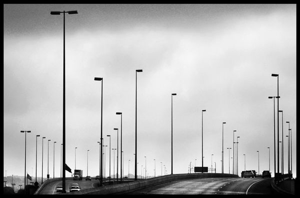
This is a different perspective on Omaha Interchange. The base has been left in and no attempt at changing the feeling of depth that exists in the light poles with them being lighter the further they are from the lens.
This is in line with one of the tenants of art that things further in the distance should be a lighter than closer objects. Not always the case but in this instance it make sense to me.
Your thoughts welcome.
.
This is in line with one of the tenants of art that things further in the distance should be a lighter than closer objects. Not always the case but in this instance it make sense to me.
Your thoughts welcome.
.
Mar 22, 2016 05:03:00 #
Firstly I think your choice of a execution of mono for this pictures is spot on. The composition is very interesting as at first glade we have 2 pictures in one, by that I refer to the two leading roads taking the viewer in to 2 different parts of the picture, --this really shouldn't work?---- but it does extremely well for a few reasons, Firstly the direction of the vehicles tells us that in fact one road leads us into the picture and the other takes us out, also the towering lines of receding lamp posts lead us along both roads to a central point at on the horizon.
I think is a very clever picture Jim,
Geoff
I think is a very clever picture Jim,
Geoff
jim hill wrote:
This is a different perspective on Omaha Interchange. The base has been left in and no attempt at changing the feeling of depth that exists in the light poles with them being lighter the further they are from the lens.
This is in line with one of the tenants of art that things further in the distance should be a lighter than closer objects. Not always the case but in this instance it make sense to me.
Your thoughts welcome.
.
This is in line with one of the tenants of art that things further in the distance should be a lighter than closer objects. Not always the case but in this instance it make sense to me.
Your thoughts welcome.
.
Mar 22, 2016 07:34:14 #
jim hill
Loc: Springfield, IL
GWR100 wrote:
Firstly I think your choice of a execution of mono... (show quote)
Thanks Geoff, I appreciate your careful analysis of the photo. Your verbalization of elements of the composition are very helpful. The other piece with only light poles and clouds was not as complex. I think it not as strong, in my opinion, as this image.
Check out Photo Critique Section section of our forum.
Mar 22, 2016 09:34:40 #

I also think this is the stronger image, though maybe not as abstract as the other. I like it better for that reason alone. I like the "Road less traveled" feel to this one.
Mar 22, 2016 09:53:37 #
jim hill
Loc: Springfield, IL
Country's Mama wrote:
I also think this is the stronger image, though maybe not as abstract as the other. I like it better for that reason alone. I like the "Road less traveled" feel to this one.
Thanks for your thoughts, CM. Appreciate your insight and sense of picture. I thought I saw something different before but it wasn't very strong.
Mar 22, 2016 10:01:57 #

jim hill wrote:
This is a different perspective on Omaha Interchange. The base has been left in and no attempt at changing the feeling of depth that exists in the light poles with them being lighter the further they are from the lens.
This is in line with one of the tenants of art that things further in the distance should be a lighter than closer objects. Not always the case but in this instance it make sense to me.
Your thoughts welcome.
.
This is in line with one of the tenants of art that things further in the distance should be a lighter than closer objects. Not always the case but in this instance it make sense to me.
Your thoughts welcome.
.
The proposition that distant things appear "lighter" than do closer things is merely an expected aspect the gradual decreased contrast associated with classic "atmospheric" / "aerial" perspective.
Dave
Mar 22, 2016 13:15:05 #

Jim, I liked the first one, but I like this one so much more. I just love the point of view from the intersecting highways. Traffic coming in and going out .. very dynamic.
Check out Travel Photography - Tips and More section of our forum.
Mar 23, 2016 10:33:47 #
jim hill wrote:
This is a different perspective on Omaha Interchange. The base has been left in and no attempt at changing the feeling of depth that exists in the light poles with them being lighter the further they are from the lens.
This is in line with one of the tenants of art that things further in the distance should be a lighter than closer objects. Not always the case but in this instance it make sense to me.
Your thoughts welcome.
.
This is in line with one of the tenants of art that things further in the distance should be a lighter than closer objects. Not always the case but in this instance it make sense to me.
Your thoughts welcome.
.
Jim,
I like the image a great deal and also like the fact that you have traffic coming and going on the two separate paths.
I also think that your darkness in the front and lightness toward the back is 'right on' with the diminishing perspective of the roads (especially the camera left road) as well as the light posts diminishing off into the horizon. Also, the natural brightness of the sky (unless you did that in Post) fading into the horizon is also a key factor in this photo. Another super item or aspect of your image (which really puts the icing on the cake) and supporting the diminishing perspective, are the subtle, but present mountain peaks on the extreme horizon camera center just about splitting the two directions of the highways. When studied, this photo has a lot of impact and seems to show a lot of fore thought before positioning the camera (your actual placement) before pressing that shutter button!
Let's face it, Jim, you did an awesome job in your capture and deserve to be applauded. Excellent photo.
Best Regards,
Tom
Mar 23, 2016 11:48:55 #
jim hill wrote:
This is a different perspective on Omaha Interchange. The base has been left in and no attempt at changing the feeling of depth that exists in the light poles with them being lighter the further they are from the lens.
This is in line with one of the tenants of art that things further in the distance should be a lighter than closer objects. Not always the case but in this instance it make sense to me.
Your thoughts welcome.
.
This is in line with one of the tenants of art that things further in the distance should be a lighter than closer objects. Not always the case but in this instance it make sense to me.
Your thoughts welcome.
.
Jim,
Tracing the lines of lights on both sides of the out-bound and the in-bound lanes (from the camera's perspective) reveals the four sinuous leading lines of perspective in this image. A really astute capture!
Dave
Mar 23, 2016 15:48:11 #
Wow... Very well composed and balanced.. My eyes are not pulled in any one direction.. Bravo!
Mar 24, 2016 18:17:34 #
jim hill
Loc: Springfield, IL
Nightski wrote:
Jim, I liked the first one, but I like this one so much more. I just love the point of view from the intersecting highways. Traffic coming in and going out .. very dynamic.
Thanks for the comparison, Sandra. I was hoping to make a bigger splash with this first image but I think I failed to realize the strength of the second one as I was pushing to fit it into a minimalist framework. Good minimalism is a very difficult thing. It's more than just a single item in a vastness. Much more.
Check out Sports Photography section of our forum.
Mar 24, 2016 18:22:42 #
jim hill
Loc: Springfield, IL
trc wrote:
Jim, br br I like the image a great deal and also... (show quote)
Tom,
I thank you for your extremely careful consideration of this image. When a viewer takes the time to really look at an image it's a moment of pride for any photographer - especially such a knowledgeable fellow photographer.
I appreciate your comments and your Critique.
Regards,
Jim
Mar 24, 2016 18:26:39 #
jim hill
Loc: Springfield, IL
Travesty wrote:
Wow... Very well composed and balanced.. My eyes are not pulled in any one direction.. Bravo!
Thanks for your lovely comments. Much appreciated.
I have been admiring the mysterious photographs on your site. You sense of lighting is superb and is you use of space.
Mar 24, 2016 21:20:28 #

Mar 24, 2016 21:57:56 #
jim hill wrote:
Thanks for your lovely comments. Much appreciated.
I have been admiring the mysterious photographs on your site. You sense of lighting is superb and is you use of space.
I have been admiring the mysterious photographs on your site. You sense of lighting is superb and is you use of space.
Indeed Jim... I meant it.... :)
Thank you for the kind words.....
If you want to reply, then register here. Registration is free and your account is created instantly, so you can post right away.
Check out Panorama section of our forum.